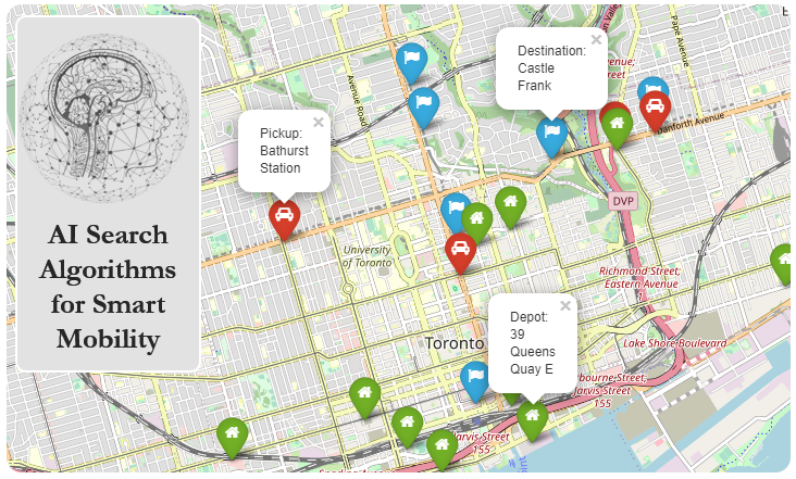
Visualization#
Using matplotlib#
Up to this point we have been plotting our maps using the matplotlib package, which is built into geopandas. While matplotlib is both easy to use and already known to many python users (as it is popular for graphing in general), it has the drawback that it is not interactive.
Using folium#
folium is a python package built to allow the use of leaflet, an open-source JavaScript library. leaflet is an interactive map development toolkit that powers a lot of web-based interactive maps. Alternatives to leaflet include MapBox, Google Maps, as well as many other paid services.
Also built upon leaflet is ipyleaflet, which is a package designed specifically for rendering leaflet maps in Jupyter Notebook. While leaflet is highly interactive and easily builds beautiful maps with little configuration, it depends on JavaScript in order to function.
Let’s replot the above map in folium. Note that folium expects geospatial data to be in EPSG:4326.
import geopandas as gpd
import folium

# file downloaded from https://data.ontario.ca/dataset/ontario-s-health-region-geographic-data
ontario = gpd.read_file(r"../../data/ontario_health_regions/Ontario_Health_Regions.shp")
ontario = ontario[(ontario.REGION != "North")]
ontario = ontario.to_crs(epsg=4326)

# Set starting location, initial zoom, and base layer source.
m = folium.Map(location=[43.67621,-79.40530],zoom_start=6, tiles='cartodbpositron')

for index, row in ontario.iterrows():
    # Simplify each region's polygon as intricate details are unnecessary
    sim_geo = gpd.GeoSeries(row['geometry']).simplify(tolerance=0.001)
    geo_j = sim_geo.to_json()
    geo_j = folium.GeoJson(data=geo_j, name=row['REGION'],style_function=lambda x: {'fillColor': 'black'})
    folium.Popup(row['REGION']).add_to(geo_j)
    geo_j.add_to(m)

m
Note
You can click anywhere inside the marked regions to show a popup indicating the region’s name. This folium map uses OpenStreetMaps’s CartoDB styling for a base layer tileset. You can read more about using custom tilesets here.
Elevation Data#
We can also retrieve interesting geospatial information in the form of elevation data.
Let’s first get the centroids for each region:
ontario['centroid'] = ontario.centroid
ontario
C:\Users\Alaa\AppData\Local\Temp\ipykernel_12892\4260188429.py:1: UserWarning: Geometry is in a geographic CRS. Results from 'centroid' are likely incorrect. Use 'GeoSeries.to_crs()' to re-project geometries to a projected CRS before this operation.

  ontario['centroid'] = ontario.centroid
| Shape_Leng | Shape_Area | REGION | REGION_ID | geometry | centroid | |
|---|---|---|---|---|---|---|
| 0 | 4.845977e+06 | 1.089122e+11 | East | 04 | MULTIPOLYGON (((-77.54191 43.89913, -77.54234 ... | POINT (-77.18411 44.89013) |
| 2 | 4.860262e+06 | 7.543033e+10 | West | 01 | MULTIPOLYGON (((-82.68871 41.68453, -82.68631 ... | POINT (-81.07741 43.36065) |
| 3 | 2.755817e+06 | 3.189867e+10 | Central | 02 | MULTIPOLYGON (((-79.70667 43.39271, -79.70805 ... | POINT (-79.65677 44.45330) |
| 4 | 2.196396e+05 | 3.715020e+08 | Toronto | 03 | MULTIPOLYGON (((-79.40671 43.74414, -79.40648 ... | POINT (-79.40531 43.67619) |
Warning
Notice that calculating the centroid raises a warning. That’s because we are using EPSG:4326, which uses degrees as a unit of measure. This makes polygon calculations inaccurate, especially at larger scales. We will ignore this warning for this example, but keep in mind that centroids will not be accurate in this projection. For better results, you can calculate the centroids of a projection that uses a flat projection (that retains area) and then reproject it back to EPSG:4326.
For web use, when the desired effect is a visual centroid, it is possible to continue using a Mercator projection like EPSG:4326, while applications that require a “true” centroid should use a projection like Equal Area Cylindrical, which avoids distortion at the poles. See here for more details.
Now, let’s query the Open Elevation API for the elevation (in metres) at the centroids for each region.
from requests import get

def get_elevation(centroid):
    query = (f'https://api.open-elevation.com/api/v1/lookup?locations={centroid.y},{centroid.x}')

    # Set a timeout on the request in case of a slow response
    r = get(query,timeout=30)

    # Only use the response if the status is successful
    if r.status_code!=200 and r.status_code!=201: return None

    elevation = r.json()['results'][0]['elevation']
    return elevation

elevations = []

for index, row in ontario.iterrows():
    elevations.append(get_elevation(row['centroid']))

ontario['elevations'] = elevations
ontario
| Shape_Leng | Shape_Area | REGION | REGION_ID | geometry | centroid | elevations | |
|---|---|---|---|---|---|---|---|
| 0 | 4.845977e+06 | 1.089122e+11 | East | 04 | MULTIPOLYGON (((-77.54191 43.89913, -77.54234 ... | POINT (-77.18411 44.89013) | 274.0 |
| 2 | 4.860262e+06 | 7.543033e+10 | West | 01 | MULTIPOLYGON (((-82.68871 41.68453, -82.68631 ... | POINT (-81.07741 43.36065) | 353.0 |
| 3 | 2.755817e+06 | 3.189867e+10 | Central | 02 | MULTIPOLYGON (((-79.70667 43.39271, -79.70805 ... | POINT (-79.65677 44.45330) | 261.0 |
| 4 | 2.196396e+05 | 3.715020e+08 | Toronto | 03 | MULTIPOLYGON (((-79.40671 43.74414, -79.40648 ... | POINT (-79.40531 43.67619) | 125.0 |
Here they are plotted on the map, using Markers to show the centroid location. You can click on the marker to show the elevation at that point.
for index, row in ontario.iterrows():
    folium.Marker(location=[row['centroid'].y,row['centroid'].x], popup='Elevation: {}'.format(row['elevations'])).add_to(m)
m
Custom Polygons#
We can also plot some custom polygons on our map.
For this particular example, let’s plot the three campuses of the University of Toronto on a map of Toronto. The campus polygons were generated manually using QGIS, but they can also be done in any GIS editor like ArcGIS or AutoCAD Map 3D.
import matplotlib.pyplot as plt

# This file was created using the QGIS Editor
uoft = gpd.read_file(r"../../data/QGIS/UofT.shp")

fig, ax = plt.subplots(figsize=(15,15))

toronto = ontario[(ontario.REGION == "Toronto")]
t = toronto.plot(ax=ax, color='none',edgecolor='black')
t.set_title("University of Toronto campuses")
uoft.plot(ax=ax, color='blue', edgecolor='black')
<AxesSubplot:title={'center':'University of Toronto campuses'}>
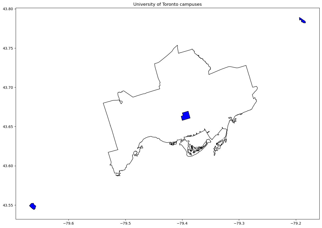
This is nice, but we can see that two of the polygons (two campuses of the University of Toronto) are floating in the middle of nowhere. That’s because our Ontario dataset only encompasses most of downtown Toronto, but ignores the other boroughs. Let’s use a Toronto municipal map instead. In this example, we’ll actually read the input as a .geojson file. It works the same way as .shp files. Let’s use the Toronto municipalities as a base layer, and plot the University of Toronto campuses on top of it.
fig, ax = plt.subplots(figsize=(15,15))
toronto = gpd.read_file(r"../../data/ontario_health_regions/TorontoBoundary.geojson")
t = toronto.plot(ax=ax, cmap='Pastel1', edgecolor='black', column='AREA_NAME', figsize=(15,15), legend=True)
t.set_title("University of Toronto campuses")
uoft.plot(ax=ax, color='blue', edgecolor='white')
<AxesSubplot:title={'center':'University of Toronto campuses'}>
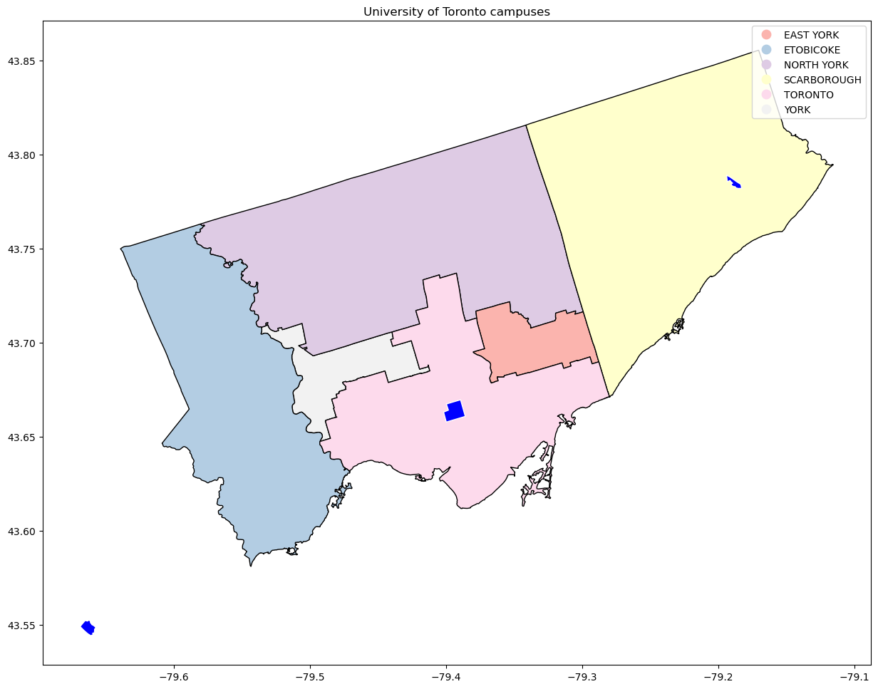
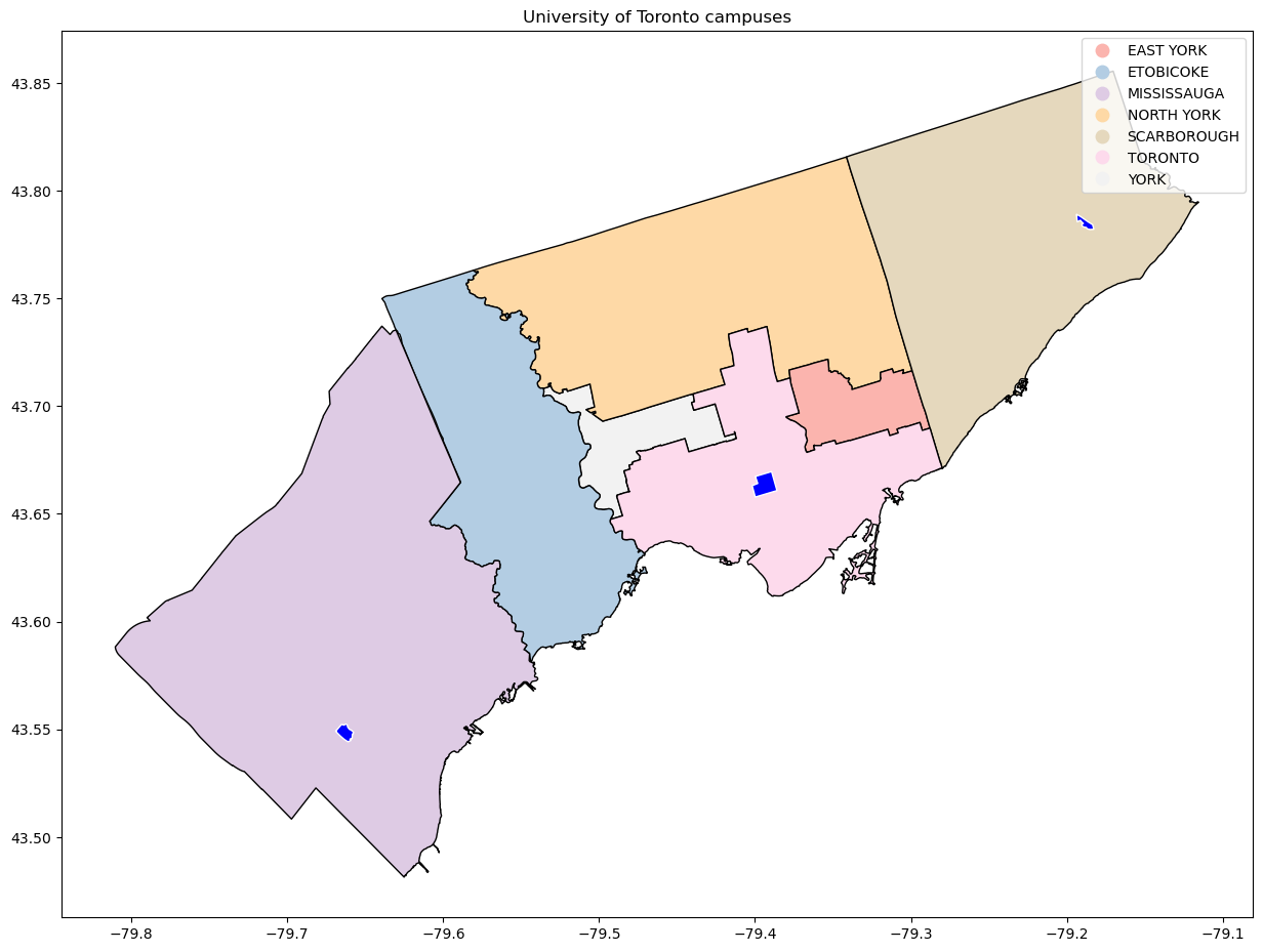
Almost there! The Mississauga campus (bottom left) is still in limbo. That’s because Mississauga is part of Peel Region, which is outside of Toronto. Let’s redo the map, including the Mississauga boundaries! This time, we’ll use a .kml file for the input. KML files are not supported by default by geopandas, so we’ll need to use a “driver” to read it. Fortunately, we can leverage fiona, a powerful python IO API, which is already built into geopandas.
gpd.io.file.fiona.drvsupport.supported_drivers['KML'] = 'rw'
missisauga = gpd.read_file(r"../../data/ontario_health_regions/MissBoundary.kml",driver='KML')
missisauga
| Name | Description | geometry | |
|---|---|---|---|
| 0 | MULTIPOLYGON (((-79.63657 43.73509, -79.63405 ... |
new_row = {
    'AREA_NAME' : 'MISSISSAUGA',
    'geometry': missisauga['geometry'][0]
}
gta = toronto.append(new_row, ignore_index=True)
C:\Users\Alaa\AppData\Local\Temp\ipykernel_12892\1538361152.py:5: FutureWarning: The frame.append method is deprecated and will be removed from pandas in a future version. Use pandas.concat instead.
  gta = toronto.append(new_row, ignore_index=True)
C:\Users\Alaa\.conda\envs\uoft\lib\site-packages\pandas\core\dtypes\cast.py:1983: ShapelyDeprecationWarning: __len__ for multi-part geometries is deprecated and will be removed in Shapely 2.0. Check the length of the `geoms` property instead to get the  number of parts of a multi-part geometry.
  result[:] = values
Now let’s try plotting the University of Toronto campuses again…
fig, ax = plt.subplots(figsize=(15,15))
g = gta.plot(ax=ax, cmap='Pastel1', edgecolor='black', column='AREA_NAME', figsize=(15,15), legend=True)
g.set_title("University of Toronto campuses")
uoft.plot(ax=ax, color='blue', edgecolor='white')
<AxesSubplot:title={'center':'University of Toronto campuses'}>
Going further
As an exercise, we could try adding Markers and/or Popups to the campuses, to show their names when clicked. Alternatively we could also change the basemap layer to a road network map (like OpenStreetMap), and plot the shortest distance (by road) between the campuses…
Visualization Types#
There are various ways to visualize geospatial data on a map. Below are a few examples of some common visualization types.
For the example in this section, data will be sourced from Statistics Canada’s dataset for Motor Vehicle Collisions in 2018 [6].
import pandas
# Import polygons for Canadian provinces and concatenate to traffic statistics
canada = gpd.read_file(r"../../data/Visualization/canada.geojson")
traffic_accidents = pandas.read_csv(r"../../data/Visualization/Canada_traffic.csv").drop(columns=['Province'])
dataset = pandas.concat([canada,traffic_accidents],axis=1).reindex(canada.index)
Chloropleth Map#
A chloropleth map showcases data by representing each region with a different colour, often varying shading based on a target metric. For this example, we will use folium to show a chloropleth map of injuries as a result of motor vehicle collisions in 2018, by province.
m = folium.Map(location=[58.4052172,-109.6062729],zoom_start=3)

# Setup binning for legend
bins = list(dataset['Injuries per 100,000 population'].quantile([0,0.25,0.5,0.75,1]))

# Main map init
folium.Choropleth(
    geo_data=dataset,
    name='chloropleth',
    data=dataset,
    columns=['name','Injuries per 100,000 population'],
    key_on='feature.properties.name',
    fill_color='BuPu',
    fill_opacity=0.7,
    line_opacity=0.5,
    legend_name='Injuries per 100,000 population',
    bins=bins,
    reset=True
).add_to(m)
folium.LayerControl().add_to(m)

# Tooltip styling
style_function = lambda x: {'fillColor': '#ffffff',
                            'color':'#000000',
                            'fillOpacity': 0.1,
                            'weight': 0.1}
highlight_function = lambda x: {'fillColor': '#000000',
                                'color':'#000000',
                                'fillOpacity': 0.50,
                                'weight': 0.1}

# Tooltip
NIL = folium.features.GeoJson(
    dataset,
    style_function=style_function,
    control=False,
    highlight_function=highlight_function,
    tooltip=folium.features.GeoJsonTooltip(
        fields=['name','Fatalities per 100,000 population','Injuries per 100,000 population','Fatalities per Billion vehicles-kilometres','Injuries per Billion vehicles-kilometres','Fatalities per 100,000 licensed drivers','Injuries per 100,000 licensed drivers'],
        aliases=['Province','Fatalities per 100,000 population','Injuries per 100,000 population','Fatalities per Billion vehicles-kilometres','Injuries per Billion vehicles-kilometres','Fatalities per 100,000 licensed drivers','Injuries per 100,000 licensed drivers'],
        style=("background-color: white; color: #333333; font-family: arial; font-size: 12px; padding: 10px;")
    )
)
m.add_child(NIL)
m.keep_in_front(NIL)
m
---------------------------------------------------------------------------
TypeError                                 Traceback (most recent call last)
Input In [11], in <cell line: 7>()
      4 bins = list(dataset['Injuries per 100,000 population'].quantile([0,0.25,0.5,0.75,1]))
      6 # Main map init
----> 7 folium.Choropleth(
      8     geo_data=dataset,
      9     name='chloropleth',
     10     data=dataset,
     11     columns=['name','Injuries per 100,000 population'],
     12     key_on='feature.properties.name',
     13     fill_color='BuPu',
     14     fill_opacity=0.7,
     15     line_opacity=0.5,
     16     legend_name='Injuries per 100,000 population',
     17     bins=bins,
     18     reset=True
     19 ).add_to(m)
     20 folium.LayerControl().add_to(m)
     22 # Tooltip styling

File ~\.conda\envs\uoft\lib\site-packages\folium\features.py:1289, in Choropleth.__init__(self, geo_data, data, columns, key_on, bins, fill_color, nan_fill_color, fill_opacity, nan_fill_opacity, line_color, line_weight, line_opacity, name, legend_name, overlay, control, show, topojson, smooth_factor, highlight, **kwargs)
   1283     self.geojson = TopoJson(
   1284         geo_data,
   1285         topojson,
   1286         style_function=style_function,
   1287         smooth_factor=smooth_factor)
   1288 else:
-> 1289     self.geojson = GeoJson(
   1290         geo_data,
   1291         style_function=style_function,
   1292         smooth_factor=smooth_factor,
   1293         highlight_function=highlight_function if highlight else None)
   1295 self.add_child(self.geojson)
   1296 if self.color_scale:

File ~\.conda\envs\uoft\lib\site-packages\folium\features.py:499, in GeoJson.__init__(self, data, style_function, highlight_function, name, overlay, control, show, smooth_factor, tooltip, embed, popup, zoom_on_click, marker)
    496         raise TypeError("Only Marker, Circle, and CircleMarker are supported as GeoJson marker types.")
    497 self.marker = marker
--> 499 self.data = self.process_data(data)
    501 if self.style or self.highlight:
    502     self.convert_to_feature_collection()

File ~\.conda\envs\uoft\lib\site-packages\folium\features.py:542, in GeoJson.process_data(self, data)
    540     if hasattr(data, 'to_crs'):
    541         data = data.to_crs('EPSG:4326')
--> 542     return json.loads(json.dumps(data.__geo_interface__))
    543 else:
    544     raise ValueError('Cannot render objects with any missing geometries'
    545                      ': {!r}'.format(data))

File ~\.conda\envs\uoft\lib\json\__init__.py:231, in dumps(obj, skipkeys, ensure_ascii, check_circular, allow_nan, cls, indent, separators, default, sort_keys, **kw)
    226 # cached encoder
    227 if (not skipkeys and ensure_ascii and
    228     check_circular and allow_nan and
    229     cls is None and indent is None and separators is None and
    230     default is None and not sort_keys and not kw):
--> 231     return _default_encoder.encode(obj)
    232 if cls is None:
    233     cls = JSONEncoder

File ~\.conda\envs\uoft\lib\json\encoder.py:199, in JSONEncoder.encode(self, o)
    195         return encode_basestring(o)
    196 # This doesn't pass the iterator directly to ''.join() because the
    197 # exceptions aren't as detailed.  The list call should be roughly
    198 # equivalent to the PySequence_Fast that ''.join() would do.
--> 199 chunks = self.iterencode(o, _one_shot=True)
    200 if not isinstance(chunks, (list, tuple)):
    201     chunks = list(chunks)

File ~\.conda\envs\uoft\lib\json\encoder.py:257, in JSONEncoder.iterencode(self, o, _one_shot)
    252 else:
    253     _iterencode = _make_iterencode(
    254         markers, self.default, _encoder, self.indent, floatstr,
    255         self.key_separator, self.item_separator, self.sort_keys,
    256         self.skipkeys, _one_shot)
--> 257 return _iterencode(o, 0)

File ~\.conda\envs\uoft\lib\json\encoder.py:179, in JSONEncoder.default(self, o)
    160 def default(self, o):
    161     """Implement this method in a subclass such that it returns
    162     a serializable object for ``o``, or calls the base implementation
    163     (to raise a ``TypeError``).
   (...)
    177
    178     """
--> 179     raise TypeError(f'Object of type {o.__class__.__name__} '
    180                     f'is not JSON serializable')

TypeError: Object of type Timestamp is not JSON serializable
Cartogram Map#
Cartogram maps distort the area or distance scale of a map to reflect a chosen variable. In this case, we can distort the area of each individual province to scale to its share of motor vehicle injuries in 2018.
import geoplot


ax = geoplot.cartogram(
    dataset,
    scale='Injuries per 100,000 population',
    legend=True,
    hue='Injuries per 100,000 population',
    legend_var='hue',
    cmap='BuPu',
    limits=(0.15,2),
    projection=geoplot.crs.WebMercator(),
    figsize=(15,15))
geoplot.polyplot(dataset, facecolor='lightgray', edgecolor='white', ax=ax)
<GeoAxesSubplot:>

In this cartogram map, we can see that Manitoba has a disproportionate share of the motor vehicle injuries.
Bubble Map#
Bubble maps show properties of the points being visualized through colour and size variations. In the example below, we vary Marker size by the Injuries per 100,000 population, while we colour provinces in blue and territories in red.
territories = ['Yukon Territory','Nunavut','Northwest Territories']

m = folium.Map(location=[58.4052172,-109.6062729],zoom_start=3)

for i,r in dataset.iterrows():
    folium.Circle(
        location=[r['geometry'].centroid.y,r['geometry'].centroid.x],
        radius = float(r['Injuries per 100,000 population'])*500,
        fill=True,
        popup=f"{r['name']}: {r['Injuries per 100,000 population']}",
        color = 'blue' if r['name'] not in territories else 'crimson'
        ).add_to(m)
m
Hexagonal Binning#
Hexagonal binning is a kind of aggregate visualization method where hexagons are drawn over the map, with each hexagon summarizing/abstracting the data that it contains.
The example below uses traffic accident data for Toronto, retrieved from the Toronto Police Service’s Public Safety Data Portal [7].
import plotly.figure_factory as ff

ksi = gpd.read_file(r"../../data/Visualization/KSI.geojson")
fig = ff.create_hexbin_mapbox(
    data_frame=ksi,
    lat="LATITUDE",
    lon="LONGITUDE",
    nx_hexagon=15,
    opacity=0.5,
    min_count=1,
    labels={'color':'Reported Accidents'},
    color_continuous_scale='turbo'
    )

fig.update_layout(mapbox_style="open-street-map")
fig.show()
Heat Map#
Heat maps use a colour gradient to represent increasing density in data. As the underlying data points increases in density, so does the intensity (or shade) of the heatmap colour. Below is an example using the same Toronto traffic data from before.
import plotly.express as px

fig = px.density_mapbox(
    data_frame=ksi,
    lat="LATITUDE",
    lon="LONGITUDE",
    mapbox_style='open-street-map',
    radius=1,
    zoom=9,
)
fig.update_layout(coloraxis_showscale=False, hovermode=False)
Cluster Map#
Cluster maps aggregate data by merging neighouring points into one larger “cluster”. This generally improves performance when rendering larger datasets, and provides an easy-to-access indicator of density.
from folium.plugins import FastMarkerCluster
m = folium.Map(location=[43.6532,-79.3832], zoom_start=10)
FastMarkerCluster([[r.LATITUDE,r.LONGITUDE] for r in ksi.itertuples()]).add_to(m)

m